Web Components
Allegro ships a set of custom HTML elements you can drop into any page. Each component handles its own markup, behavior, and styles — just add the script tag and use the element wherever you need it.
| Component | Element | Description |
|---|---|---|
| Login Form | <allegro-login-form> | Authenticates readers via magic link or OAuth |
| Email Form | <allegro-email-form> | Collects email addresses with a confirmation state |
| Content Gate | <allegro-content-gate> | Blocks content behind a full-page registration or paywall prompt |
| Content Gate Inline | <allegro-content-gate-inline> | Hides inline article content at a specific position until the reader authenticates |
| Form | <allegro-form> | Renders an admin-composed form of user attributes for the authenticated member |
| Recommendations | <allegro-recommendations> | Lists personalized article recommendations for the current reader |
| Modal | <allegro-modal> | Shows a centered dialog, such as a welcome note, that the reader closes |
| Bottom Drawer | <allegro-bottom-drawer> | Raises a panel from the bottom of the screen that does not block the page |
Shared theme variables
Each component's own CSS variables fall back to a small set of shared
--allegro--* variables. Set these once on :root to theme every component
together, then override individual components where they need to differ.
:root {
    --allegro--color-primary: #0f766e;
    --allegro--radius: 0;
}
| Variable | Used for |
|---|---|
--allegro--color-primary | Buttons, focused input borders, checkboxes, and icons. |
--allegro--color-primary-contrast | Text on primary-colored buttons. |
--allegro--color-background | Component and input backgrounds. |
--allegro--color-text | Body and heading text. |
--allegro--color-muted | Secondary text such as descriptions and disclaimers. |
--allegro--color-border | Input and button borders. |
--allegro--color-error | Error messages and required-field markers. |
--allegro--color-success | Success indicators. |
--allegro--font-family | Text in every component. |
--allegro--font-family-heading | Headings in the login form and recommendations. |
--allegro--font-size | The base sizing unit that u(n) defaults are measured in. |
--allegro--radius | Corner radius of dialogs, inputs, buttons, and images. |
--allegro--spacing | Gap between slotted children in the content gates. |
--allegro--focus-ring-color | Keyboard focus ring on buttons and links. Falls back to --allegro--color-primary. |
Each component page lists the exact fallback for every variable, so you can see which shared variable it reads.
Previewing components
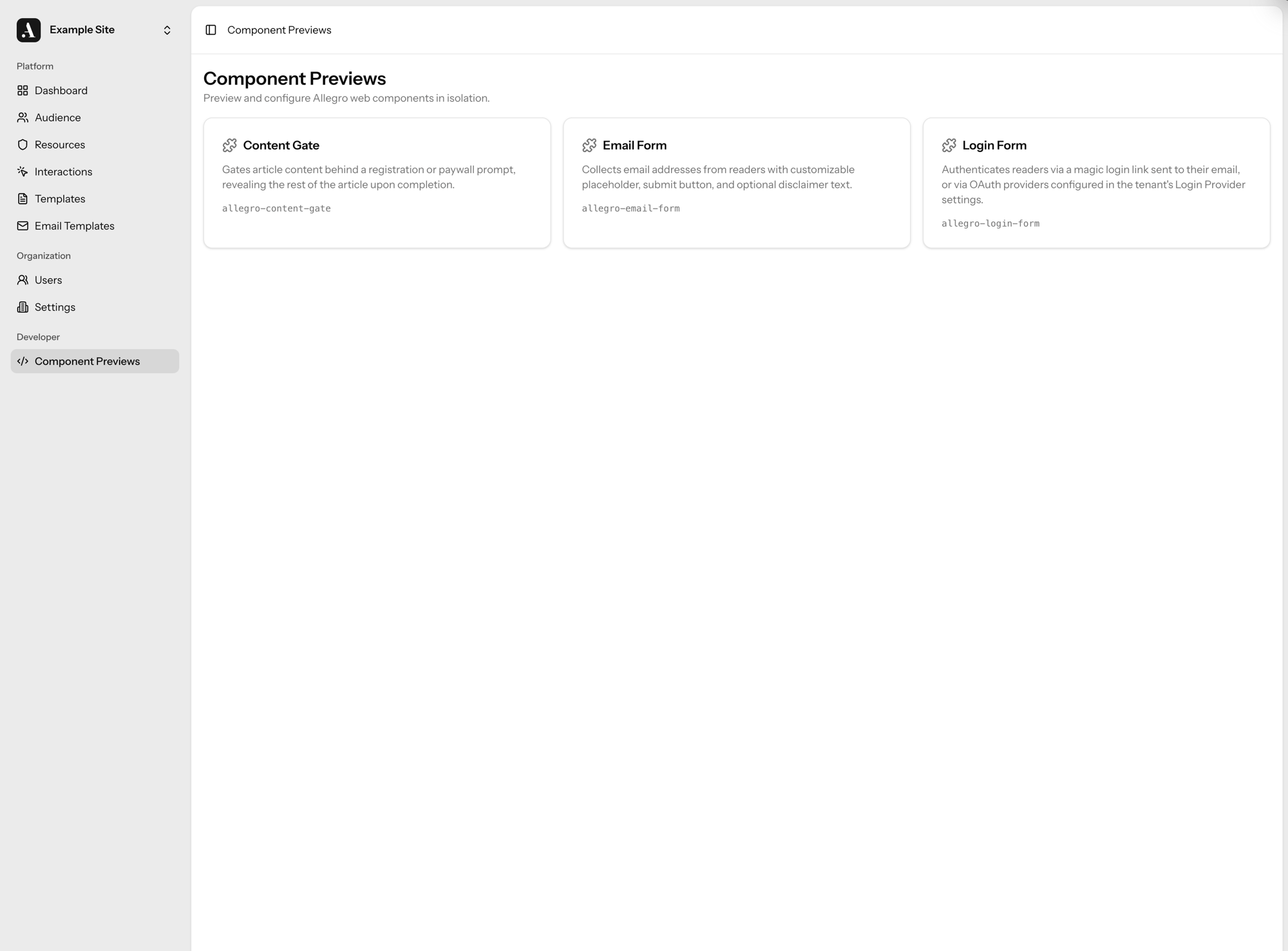
The Allegro admin includes a Component Previews page under the Developer section. It renders each component in isolation so you can tweak attributes and see results without deploying to your site.
Navigate to /developer/components in your Allegro instance to open the preview
tool.
Previewing as a signed-in member
Some components behave differently for an authenticated reader — the Form component, for example, renders the current member's saved values. The preview sandbox includes a Preview as selector so you can render a component as if a specific audience member were signed in, without leaving the admin or touching your live site.
Pick a member from the selector (search by email or display name) to render the component inside an authenticated session for that member. Choose Logged out to return to the anonymous view.
A component previewed as a member acts on that member's real data. If you submit the Form component while previewing as someone, their stored attribute values are updated for real.
The selector only appears for roles that can edit audience members, and outside a production environment it is limited to super admins.
Attribute suggestions
Text attributes that map to existing data offer autocomplete suggestions as you
fill them in. The Form component's slug attribute, for instance, suggests the
slugs of forms already defined in your organization, so you can preview a real
form without copying its slug by hand.