Email Theme
The email theme is the shared look of the emails Allegro sends: the page background, the email card, fonts and text colors, headings, links and buttons, the logo header, and the footer. You set it once, and every email template and workflow email built with blocks picks it up. Emails written in HTML can opt in.
Edit the theme under Organization Settings → Branding, on the Email tab. The tab sits after the component tabs at the top of the editor.
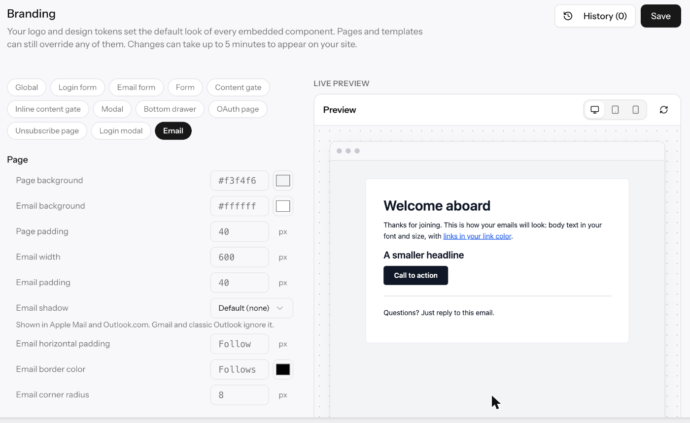
The email theme comes with the email builder, which is turned on per organization. If you don't see an Email tab under Branding, ask your Allegro contact to turn on the email builder for your organization.
Where the theme applies
| Themed? | |
|---|---|
| Built-in emails you haven't customized, such as sign-in codes | Yes. They're built from blocks, so a new organization's theme reaches them right away. |
| Any email in builder mode | Always. |
| Any email in HTML mode | Only when Use email theme is on for that email. |
How values are chosen
Each theme setting can be set at three levels. For every setting, Allegro uses the most specific value:
- This email, set with the Theme button in the email editor.
- The property, set on the property's Branding page. See Properties → Branding.
- The organization, set under Organization Settings → Branding.
- Your brand, for the few settings that follow a global branding token: body and heading fonts, link and button colors, button text color, and corner radius.
- Allegro's default, listed in the tables below.
An empty field shows, in gray, the value it inherits. When you set a value, the label turns bold, a dot appears beside it, and a reset button (↺) clears it so the field inherits again.
Leave Link color and Button background empty to use your primary brand color, and leave the fonts empty to use your brand fonts. On the organization page the gray placeholder shows Allegro's default, but your brand value is what emails use.
Theme settings
The settings are grouped the same way in Branding and in the per-email Email theme drawer. Sizes are in pixels unless noted.
Page
| Setting | Default | What it controls |
|---|---|---|
| Page background | #f3f4f6 | The color around the email card. |
| Email background | #ffffff | The email card's color. |
| Page padding | 40 | Space between the edge of the inbox and the card (0–120). |
| Email width | 600 | The card's width (320–800). |
| Email padding | 40 | Space inside the card (0–80). |
| Email shadow | None | None, Soft, Medium, or Strong. Shown in Apple Mail and Outlook.com; Gmail and classic Outlook ignore it. |
| Email horizontal padding | Email padding | Space inside the card on the left and right only (0–120). |
| Email border color | Divider color | The card's thin outline. |
| Email corner radius | 8 | How rounded the card's corners are (0–40). Follows your brand radius when it's in pixels. |
Text
| Setting | Default | What it controls |
|---|---|---|
| Body font | System fonts | The font for body text. Follows your brand font. |
| Text color | #111827 | Body text. |
| Text size | 16 | Body text size (10–28). |
| Line height | 160% | Space between lines of body text (100–250%). |
| Muted text color | #6b7280 | Muted text blocks and, by default, the footer text. |
Headings
| Setting | Default | What it controls |
|---|---|---|
| Heading font | Body font | Follows your brand heading font. |
| Heading color | Text color | |
| Heading weight | 600 | 400, 500, 600, or 700. |
| Heading letter spacing | 0 | −2 to 10. |
| Heading line height | 125% | 80–250%. |
| Heading 1 size, 2 size, 3 size | 32, 22, 18 | The Title, Subtitle, and Heading blocks (10–72). |
Links and buttons
| Setting | Default | What it controls |
|---|---|---|
| Link color | #2563eb | Text links. Follows your primary brand color. |
| Button background | #111827 | Follows your primary brand color. |
| Button text color | #ffffff | Follows your brand's Primary text color. |
| Button corner radius | 6 | 0–999. Use a large value for pill-shaped buttons. |
| Button text weight | 600 | 400, 500, 600, or 700. |
| Button vertical padding | 12 | 0–40. |
| Button horizontal padding | 24 | 0–80. |
| Divider color | #e5e7eb | Divider blocks and, by default, the card's border. |
Header
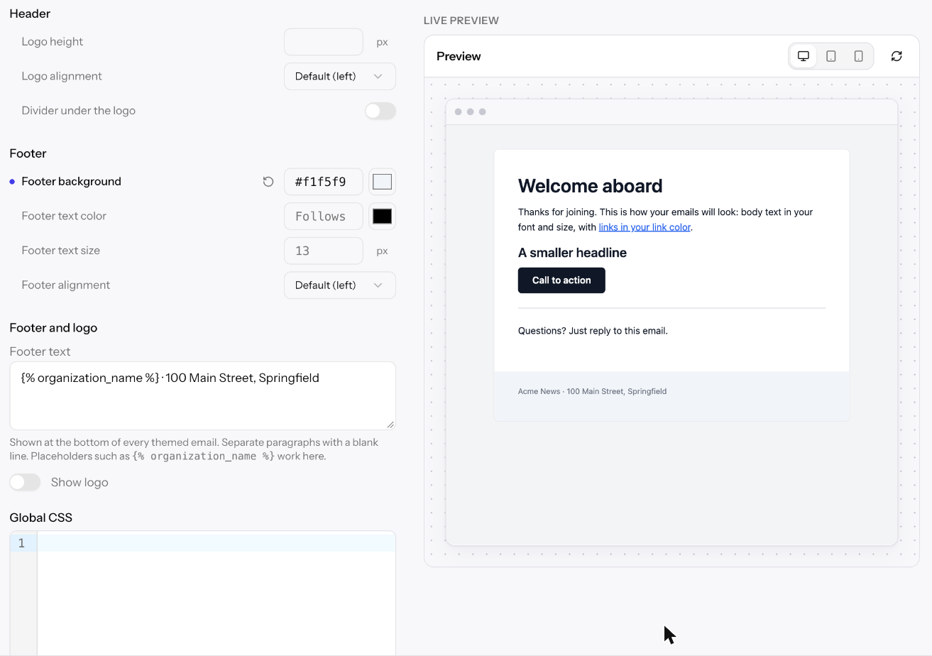
The header shows your branding logo above the email's content. Turn it on with Show logo (see Footer and logo).
| Setting | Default | What it controls |
|---|---|---|
| Logo height | Natural size, up to 160 wide | The logo's height (8–120). |
| Logo alignment | Left | Left, center, or right. |
| Divider under the logo | Off | Draws a line in the divider color below the logo. |
Footer
| Setting | Default | What it controls |
|---|---|---|
| Footer background | None | Set a color to turn the footer into a full-width band across the bottom of the card. |
| Footer text color | Muted text color | |
| Footer text size | 13 | 8–24. |
| Footer alignment | Left | Left, center, or right. |
On phones, the card fills the screen: its padding drops to 16 pixels, and its rounded corners and shadow are removed.
Footer and logo
Below the theme settings, the Footer and logo section sets content every themed email shares:
| Setting | What it does |
|---|---|
| Footer text | Shown at the bottom of every themed email, up to 2,000 characters. Plain text only: separate paragraphs with a blank line. Placeholders such as {% organization_name %} work here, so a mailing address or a reason for receiving the email can stay current. |
| Show logo | Adds your branding logo in the header of every themed email. It has no effect until a logo is uploaded under Branding, and SVG and WebP logos are left out because Gmail and Outlook don't display them. Use a PNG or JPEG logo for email. |
On a property's Branding page, an empty Footer text shows the organization's footer, and Use organization value beside Show logo returns it to the organization's setting.
Global CSS
Global CSS adds your own CSS to every themed email, after the theme's styles, so it wins when both style the same thing. Use the selectors the theme styles.
.email-footer a {
    color: #0f766e;
}
Allegro writes your rules into each element's style attribute, because many
email clients ignore <style> blocks. Rules it can't write inline, such as
@media queries, are kept in the email's <style> block.
Global CSS can be up to 20,000 characters, and can't contain <, @import,
expression(, or {% %} placeholders.
Gmail ignores dark-mode rules, and classic Outlook ignores media queries, rounded corners, and web fonts. Check important styling with a test email.
CSS stacks from broad to narrow: the theme's styles, then the organization's Global CSS, then the property's, then the email's own. Each later layer wins a tie.
Previewing changes
The preview beside the settings shows a sample email with a heading, a link, a smaller heading, a button, a divider, and your footer. It updates a moment after you change a setting, before you save, so you can try values freely. Switch it between desktop and mobile widths.
Click Save to apply the theme. Like the rest of Branding, each save is a revision you can restore from History. See Branding → Saving and revisions.
Overriding the theme for one email
To change the theme for a single email, open it and click Theme beside the tabs. The Email theme drawer lists the same settings, with your branding's values as placeholders. Anything you set applies to this email only. The Theme button shows how many values you've overridden.
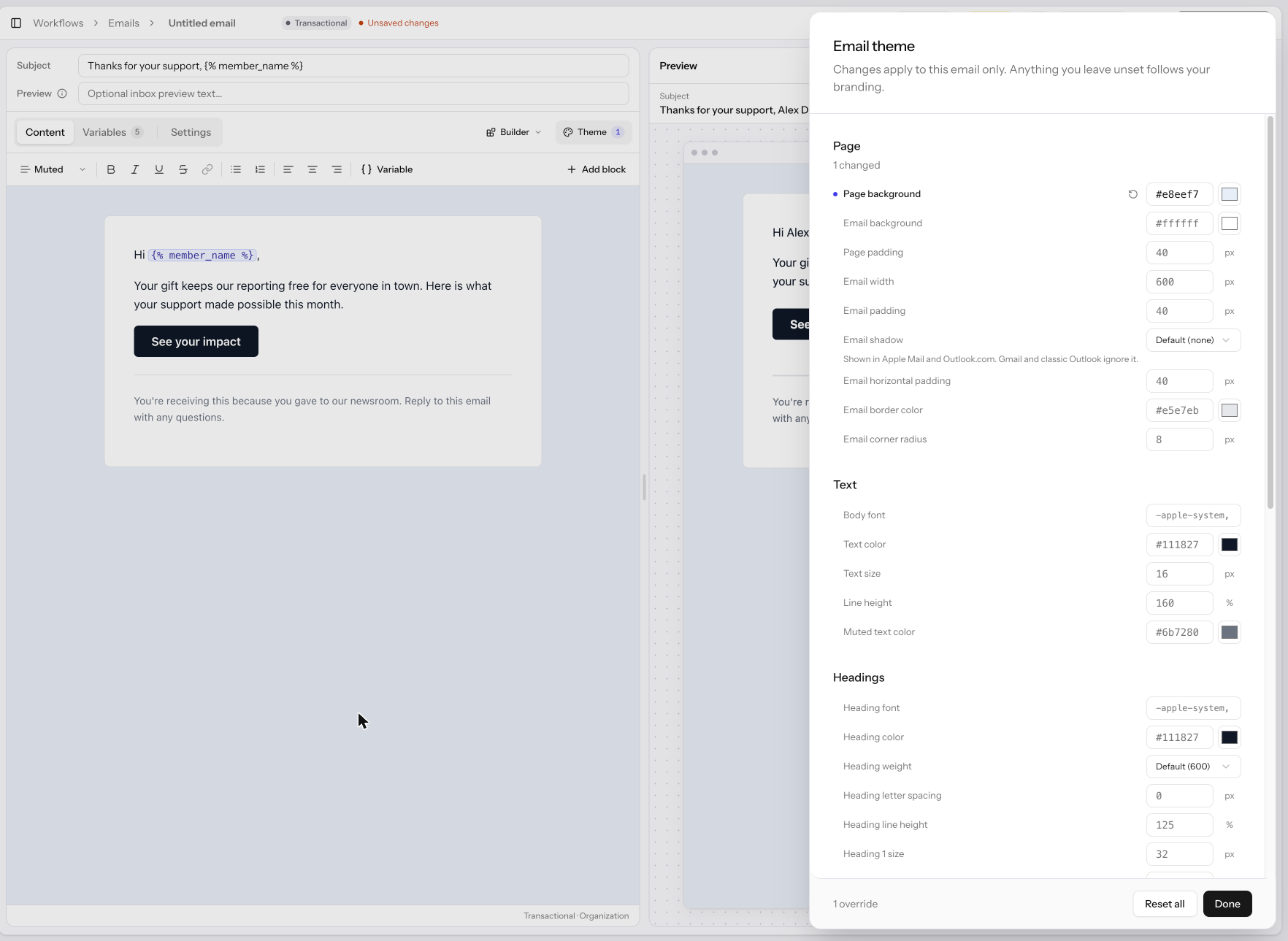
- Click ↺ beside a setting to remove its override, or Reset all to remove every override.
- In the builder, the drawer ends with an Email CSS section. Click Edit CSS to add CSS for this email only, applied after your theme. In HTML mode, use the CSS tab instead.
- Changes show in the editor and preview right away, and are saved with the email.
Properties
A property can override any theme setting, the footer text, Show logo, and the Global CSS on its own Branding page. Everything it leaves empty follows the organization. A property's emails then use the property's theme.
Related Links
- Building Emails — the builder and HTML editors
- Branding — logo and global design tokens
- Properties → Branding